Pulse
Client
Lumen Health
Direction
Brand Strategy
Visual Identity
Signage & Environment
Date
About the project
Challenge
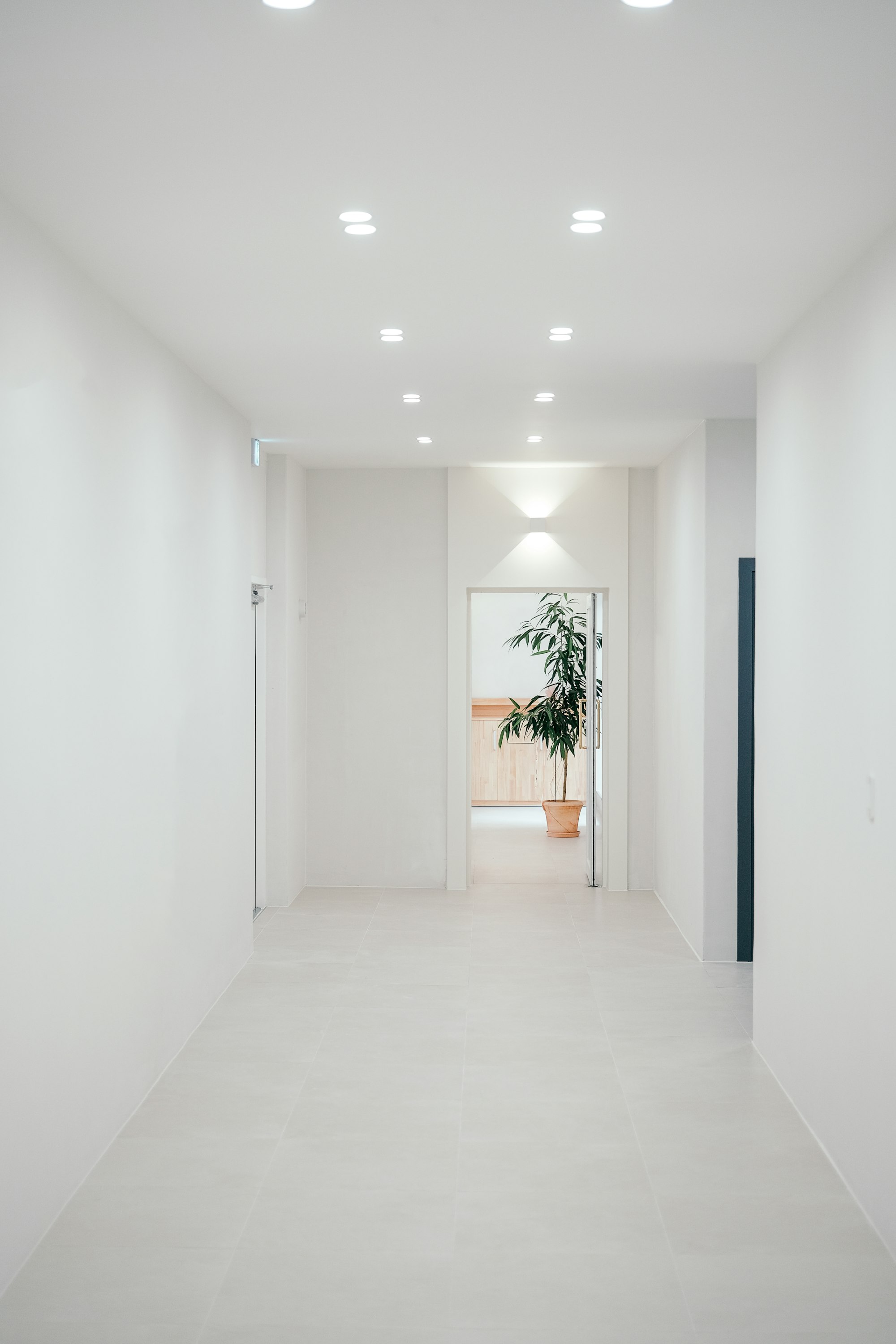
Lumen Health was opening a network of neighbourhood clinics, but the category looked cold and clinical. Patients described healthcare brands as intimidating, and the founders wanted a place people would actually feel calm walking into.
Approach
We defined a brand around quiet confidence: a soft pulse-line symbol, a pale palette of white, sage and sand, and a plain-spoken tone of voice. The identity extends into wayfinding, reception design and appointment materials so every touchpoint feels like one gentle experience.
Result
The first three clinics reached full capacity within eight weeks, and patient surveys rated the experience 4.8 out of 5 for feeling at ease.